 As the weather slowly starts to get warmer, I think it’s safe to say we’re all eagerly awaiting Spring. Fall might be known as the season for fashion, with deep colors, layering techniques, and varying textures, but there is nothing like being able to go out rocking your new favorite outfit without covering it up by a bulky winter coat. Aside from the warm weather, sunny days, and chirping birds, I’m most excited for the colors that are on-trend for Spring 2013. With a little help from Pantone’s Fashion Color Report for Spring 2013, let’s dive into the pretty pastels and bold hues that will be showcased this season.
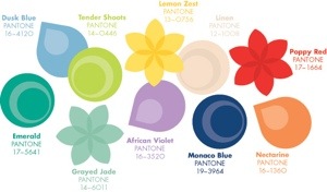
Emerald (Pantone 17-5641) is Pantone’s color of the year, and we’re starting to see it everywhere. Pair an Emerald blouse with your favorite jeans or leggings for a classic look, or sport an Emerald frock for an all-over color look. Emerald isn’t just for fashion – Sephora’s Color of the Year collection proves that dark green is a definite beauty do. For more ways to incorporate Emerald into your look this year, check out our full color report on Pantone’s 2013 Color of the Year.
 Dusk Blue (Pantone 16-4120) is a pale, not-quite-pastel shade of blue. The Fashion Color Report for Spring 2013 is filled with bright, bold colors and light, dusty shades. Dusk Blue is obviously one of the dusty shades. For those who are shy about color, these light, not-quite-pastels are the perfect way to bring some color into your wardrobe!
Linen (Pantone 12-1008) is the new neutral this season. It’s a soft, matte, almost-blush color that really complements any skin tone. Pair any of these on-trend colors with Linen to help them stand out, or pair Linen with black and white for Linen to be your color focus! Like all neutrals, this is a super versatile color.
Monaco Blue (Pantone 19-3964) is a deep, dark blue, similar to navy. My favorite way to wear Monaco Blue is to pair it with Dusk Blue or Poppy Red for a cute nautical look. Incorporate it into your beauty routine by swapping your black or brown eyeliner with a Monaco Blue shade. Dark blue eyeliner is arguably more flattering than black eyeliner, anyway! Try Laura Geller’s I-Care Waterproof Eyeliner in Navy. Smoke it out with some dark blue eyeshadow for a sultry nighttime look.
 Bright, bold colors come into play this Spring with Tender Shoots (Pantone 14-0446), a vibrant lime green. Unless you’re going for bold, I wouldn’t incorporate Tender Shoots into your beauty routine, but it’s the perfect color to add a splash to your wardrobe! Keeping the rest of your outfit fairly neutral (this is the perfect chance to work the black and white trend!), bring a pop of color with a tank top or statement bib necklace in a lime green Tender Shoots shade.
Grayed Jade (Pantone 14-0641) is another almost-pastel. Think of a dusty version of Emerald. It’s a shade of mint, which is another huge trend right now. To go bold with this color, pick up a pair of Grayed Jade skinnies. For a more subtle look, bring the color into your outfit with a hand bag or some accessories.
 The yellow of all yellows, Lemon Zest (Pantone 13-5641) is another bright, fun color to incorporate into your wardrobe. This isn’t at all neon – it’s classic yellow. As shown to the left, Lemon Zest might be a bold color, but it’s not in-your-face. You can wear this color head-to-toe (like this dress – I probably wouldn’t recommend yellow pants with a yellow shirt) for a pretty, girly look.
African Violet (Pantone 16-3520) is a pale purple, but not quite lavender. It falls more into a dusty purple than a pastel. This color is really versatile and universally flattering. You can wear an African Violet dress, blouse, skinnies, or you can just work it into your wardrobe with a pretty floral pattern. I don’t think African Violet is nearly as flattering with makeup, though. I’m not a big fan of pale makeup, so I wouldn’t wear African Violet eyeshadow, but if you can pull it off, more power to you! A more flattering way to incorporate African Violet into your beauty routine? Try the Kevin Murphy Color Bug in Purple to (temporarily) get African Violet locks.
 Poppy Red (Pantone 17-1664) is a bright, fun color to sport this spring. Try wearing a “pop” of Poppy Red on your lips for a bold beauty look, or for something more subtle, incorporate it with a dress with a floral pattern. Try NARS Semi Matte Lipstick in Heat Wave to get a Poppy Red pucker.
Nectarine (Pantone 16-1360) is a softer, more pastel shade of Pantone’s 2012 Color of the Year, Tangerine Tango. Tangerine Tango was all about being bright and bold. Nectarine packs all the color, but is a little less in-your-face. If you’ve ever been worried about wearing orange, start with a pop of Nectarine in a chunky necklace or statement earrings. Unless you’re a pro, avoiding orange when it comes to beauty is probably a good idea.
What I love most about Pantone’s Spring Fashion Color Report is that each of these colors goes perfectly with the others. Whether you’re incorporating them into your beauty routine or your closet, which of these Spring colors is your favorite?

African Violet is 100% my color for Spring. I’ve been wearing violet nail polish like a madwoman since I got it. I have a little bit of a darker purple eyeliner from D&G that totally works, so all hope is not lost on violet makeup!
[…] you committed our Pantone color trend guide of the season to memory, you’ll notice that a lot of this collection’s hot nail color shades were […]
I LOVE THIS! Pantone colors are all so fabulous and Monaco Blue is a prime example! We love it so much that we made it our color of the week and put together a fabulous outfit on our blog to show how to dress wearing Pantone’s Monaco Blue using a triadic color palette. You can take a look at it here http://www.weartostandout.com/blog/pantone-monaco-blue and tell us what you think! xoxo, WearToStandOut
Thanks so much! We’ll be sure to check out your blog 🙂